Hi Automate Community!
This week's tip covers dashboard reports that were released in Studio Administrator in October 2025. These dashboard reports are available to everyone using Studio Administrator. If you're a global admin, you'll see the reports with everyone's usage and if you're not an admin, you will see the reports with your own usage.
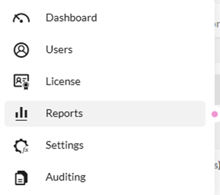
When you log in to Studio Administrator, select Reports in the menu pane on the left:
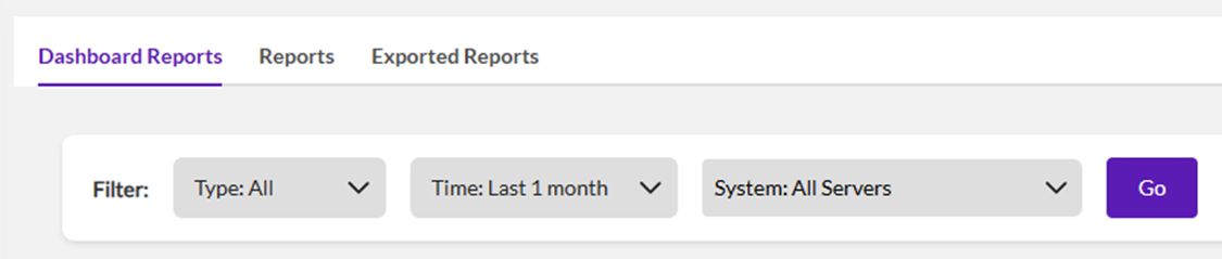
In the dashboard reports page you'll see filters on the top:
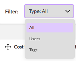
The first filter allows you to filter by one or more users or tags (tags are assigned to users and can also be created where they are assigned):
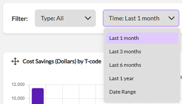
The second filter allows you to filter by different time frames (the default is the last 1 month):
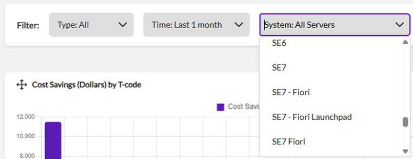
The third filter allows you to filter by one or more SAP systems:
The dashboard reports page includes several out of the box bar charts.
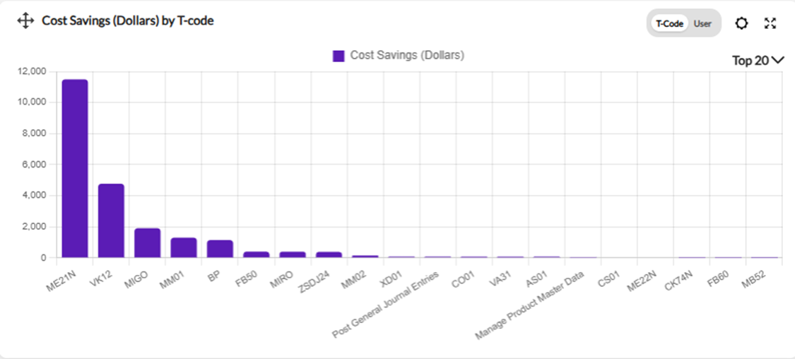
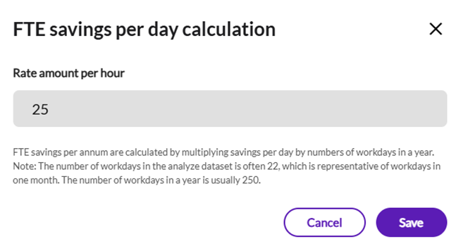
The upper left chart is Cost Savings (Dollars) which can be viewed by T-Code or by User. There is also a settings icon where you can change the rate amount per hour used to calculate the FTE savings per day (the default is 25):
The upper right chart is Time Savings (Hrs) which can be viewed by T-Code or by User:
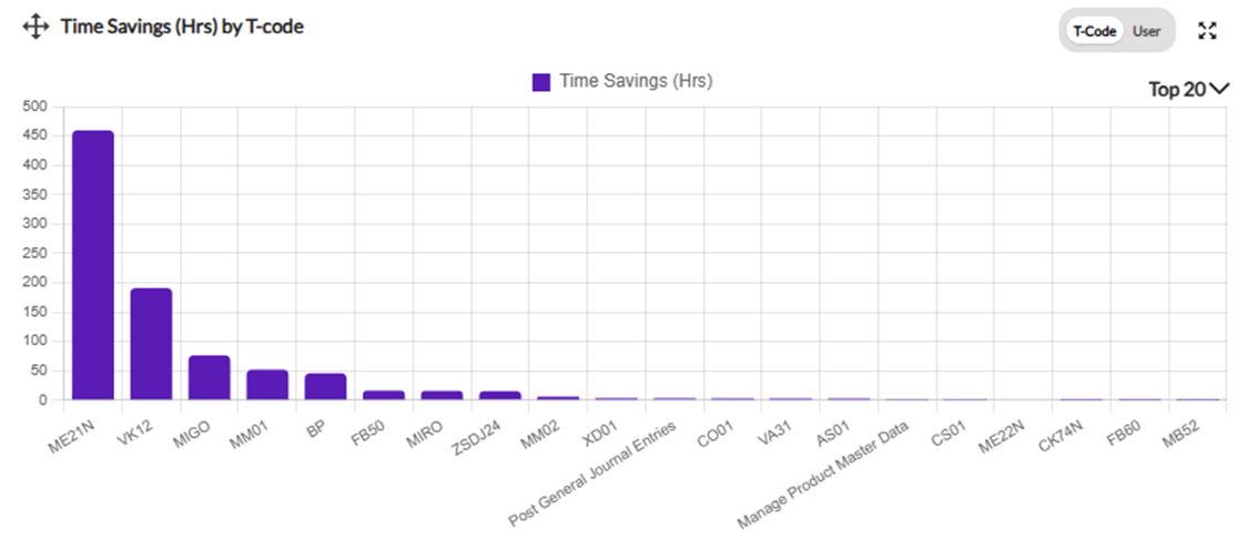
The cost savings and time savings are calculated based on the script recording time. For more details please refer to this tip of the week on calculating ROI.
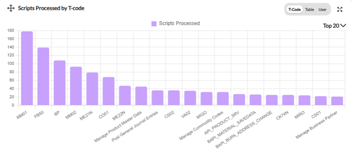
The middle-left chart is Scripts Processed by T-code which can be viewed by T-Code or by User. There is also an option to view by Table which shows the Query scripts processed by table:
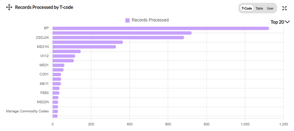
The middle-right chart is Records Processed by T-code which can be viewed by T-Code or by User. There is also an option to view by Table which shows the Query records extracted by table:
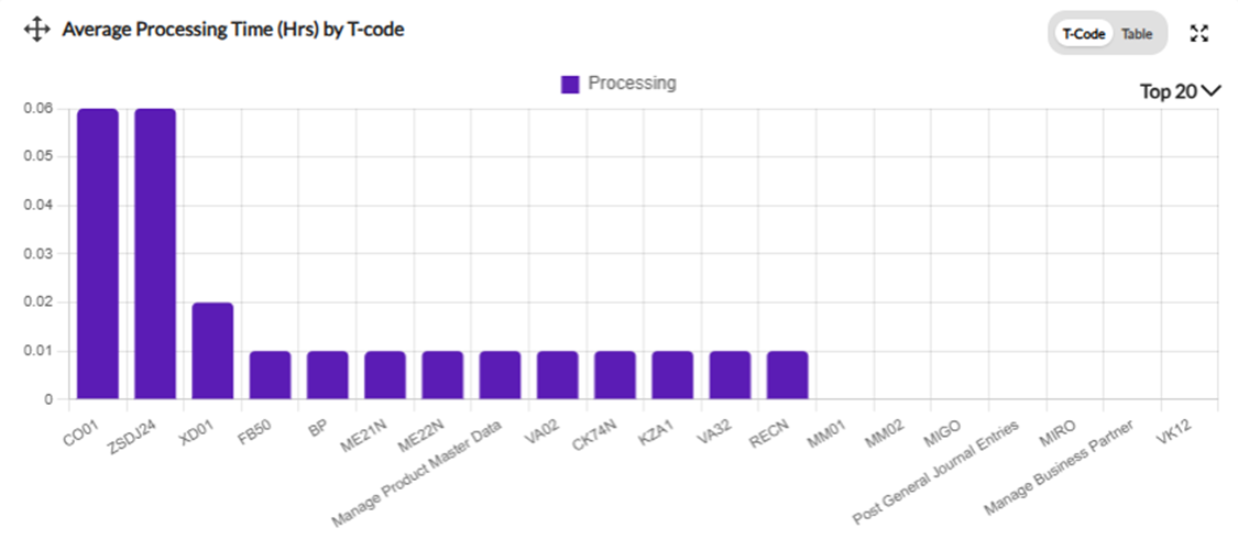
The lower left chart is Average Processing Time (Hrs) which can be viewed by T-Code. There is also an option to view by Table which shows the average processing time for Query scripts by table:
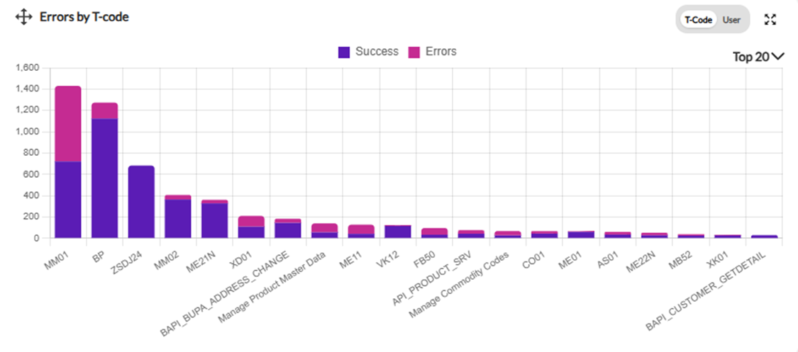
The lower right chart is Errors by T-code which can be viewed by T-Code or by User. The chart shows the number of success records in purple and the number of error records in pink:
All these charts provide the following options:
- Hover over a bar in the chart to see the exact number.
- Move the chart around using the icon in the upper left corner.
- Expand the chart using the icon in the upper right corner.
- Change the default of Top 20 to Top 5, Top 10, or Top 15.
Here is the help page on working with Studio Administrator dashboard reports.
If you need more detailed usage information, please go to the Reports tab on the top of the Reports page.
If you have any ideas or suggestions for these dashboard reports or anything else, please create one on our Ideas page.
Thank you!
------------------------------
Maria Ebner
*Precisely Software Inc.
------------------------------